Zeitcaster Event Discovery Experience
Help people navigate through thousands of events to find the relevant ones.
Role
UXUI Design
Interaction Design
Team
4 Designers
3 Enginners
Duration
2021.02-current
around 200 hr
Category
Design Challenge
Turned into Freelance

Context
Background/Last winter, I participated in the UX Result Hackathon with a few friends, May, Nora, and Elijah. We won the Zeitcaster Design Challenge and then got the opportunity to continue working with Zeitcaster to redesign their product.
About Zeitcaster/Zeitcaster is a location-based curated library of events for people who plan for their friends, parents, and kids.
Events in Zeitcaster are collected by editors living in this community representing different age groups. Currently, it provides in-person event information in massechussets and online event information in the US.
My Role/After the hackathon, I was mainly responsible for the Event discovery experience.
During the Hackathon, we all contributed to different aspects of the challenge. After the Hackathon, the project scope includes the event discovery experience, event saving experience, create account experience, and the editors’ experience. I was mainly responsible for the UXUI of the event discovery experience, the interactions, and the interactive prototype. I also initiated the style guide and the pattern library. Phase 1 was launched and the rest are still in development.
Impact after launching phase 1/35.57%↑ Pageviews
5.1%↑ Returning Users
101.69%↑ Average Session Duration
Review from the Client ↓

Problem
Zeitcaster offers thousands of events, yet users cannot find the event they are interested in.
Before Redesign ↓

Solution
Quick View
Users can use the keyword search to find what they have in mind, filter down their options, browse events using the map, and view more events from the same organizer and same category around.


Search
Keyword search and location search are prominent on global navigation, helping users to navigate the site.

Filter
A horizontal filter bar helps save visual space, shows the users the context of their search results, and allows users to understand the range of the events Zeitcaster is covering.

Map
While hovering on the card, the pin on the map will highlight the location.
While clicking on the pin, a thumbnail of the event will pop up.

Interaction
I added interactive details, different states, fixed positions, etc., to optimize the experience, emphasizing often-used functions and improving clarity.

Process >>>>>>>>
Understand
Business Context/
What are the metrics?
The client wanted to improve user engagement. Since there are more new users than returning users now, our priorities are activation and retention. The metrics we are looking at are page views, average Session Duration, and Returning Users.

User Interview
What do people care about the most when searching for events?
We first interviewed 9 people in the 24-35 age group (the primary user group) and then organized information into groups to find patterns.

Interview Insights

*Define
How might we?
1/ Nav & Filter: Informative & a sense of control
How might we help new users to learn about what this website is offering and also feel a sense of control and orientation?
2/ Get closer to the desired content
The current searching experience is confusing, how might we design the searching experience to help users find the relevant results?
3/ Responsive in mobile
60% of the users are viewing the website from their phone, how might we design the experience to work both on desktop and mobile.
*HMW1 Nav & Filter: Informative & a sense of control
Filter Bar
Position: Side or Top?
Since the Zeitcaster website contains a large number of events, a filtering system is a must. How can we layout the filter to help users understand the context and also considering how it could transfer to mobile?

We chose the top filter bar instead of the side filter because of the following reasons I collected:
🔸 It keeps the user’s attention in one place
🔸 Users frequently overlook the sidebar.
🔸 It is easier to scan and it can help our users learn about what this website’s offering.
🔸 Also, Baymard’s study shows that a horizontal filter bar significantly outperforms the left-sided one in terms of convenience and efficiency.
Search box
“We don’t have a search feature developed, is it necessary?”
We always consider search the most important feature for the site, yet the function isn’t developed and the client is leaning towards not having it or put it in the less prominent position.
I convinced the client for the following reasons:
🔸 Search is intuitive. It can be the fastest route to discovery.
🔸 Giving users a feeling of breadth or depth of the site's selection
🔸 Supporting users’ ability to return to an event previously found or heard of from friends.
🔸 Search allows us to learn about the users' needs. It tells us what they're looking for and we can optimize the website so that it delivers relevant information to users.
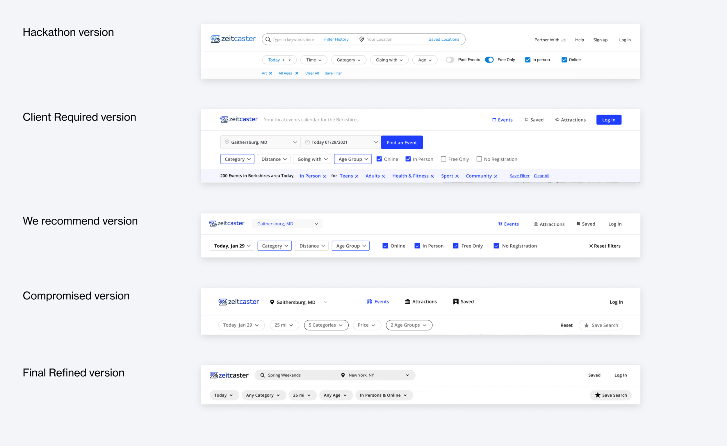
Batch filter vs Interactive filter
“Why not refresh reacting to users’ every selection? It can show them how their actions are impacting the results. “
Batch filtering means that the page refreshes and gives results only after you’ve made some selection and clicked the Apply button. Interactive filtering is when the system reacts to your every choice and refreshes the page every time.
I chose to use an interactive filter for single choice and a batch filter for multiple choice.
The page only refreshes after multiple selections are made; the selection will also reflect on the filter bar and the header on top of the results.
Also, I added a loading refresh state to help users understand that the page is updated with new data.

Breadcrumbs
Sometimes the users land on this event detail page directly from the google search.
Users need breadcrumbs as an important navigational element that supports wayfinding — making users aware of their current location within the hierarchical structure of a website.

*HMW2 Get closer to the desired content
Filter Bar
“I don’t care what to do, I just want to find something we can do together. ” - Chloe
During the interview, we found that sometimes users don’t care much what the event itself but who they are going with. The events can be categorized into events good for family, romantic partners, coworkers, friends, or meet someone new. With this filter, users can quickly filter the results down to the relevant ones.

Location Search:
Dropdown list vs. keyword search?
Dropdown list could be disappointing.
The site before redesign only allows users to select from their location list. It is disappointing for users to not able to find their location, and they will leave the site since they would assume the event information are not relevant. However, Zeitcaster does provide online event information which could be relevant for users anywhere in the world.

Useful No Result Page
What if my location is not covered?
We know that many users could possibly not be able to find anything nearby since the location is not covered yet. However, a useful no result page could keep them staying.


*HMW3 Responsive in mobile

Filter bar
We decided to keep all filters in a horizontal scroll bar and also adding one all filter button for users to view filters in one place.


*Style Guide

Responsive Components


*Learnings
1/ I learned to always prepare plenty to support my idea.
During every design review, the client wants to see all other possibilities and the reasons to choose one over all others. However, this mode isn’t the most efficient one, so I learned to always prepare the versions the client wants and the ones I recommended. If I decide to convince the client, I would always prepare enough resources ranging from user perspectives, case studies of competitors, and usability research articles. It isn't easy to persuade the client, so I always make sure there is plenty of evidence supporting my idea.
2/ Let the users talk
There are times we have different opinions with the client just because there are things we simply haven’t learn from the users yet. While discussing with the client, we never disagree just to disagree, we either both win or both lose. Only users know if it is a win. Every time when we meet a disagreement, we prepare a test or think of ways to collect feedback from the users.
The following is a user test we did while we had a disagreement about adding images to the card or not because currently we didn’t collect images for the events and it would increase the cost to add them. We found all users preferred the one with images because it feels more reliable and attractive.
More testing is planned and ongoing…

More Projects ↓


Praesent id libero id metus varius consectetur ac eget diam. Nulla felis nunc, consequat laoreet lacus id.